pocket diary wants to be small photo book | agenda wil fotoboekje zijn
Een drukkerij kan in zijn drukwerk laten zien wat het allemaal kan. Elke huisstijluiting op een andere papiersoort, op elke uiting een ander kleurgebruik. Eenheid in verscheidenheid, zoiets.
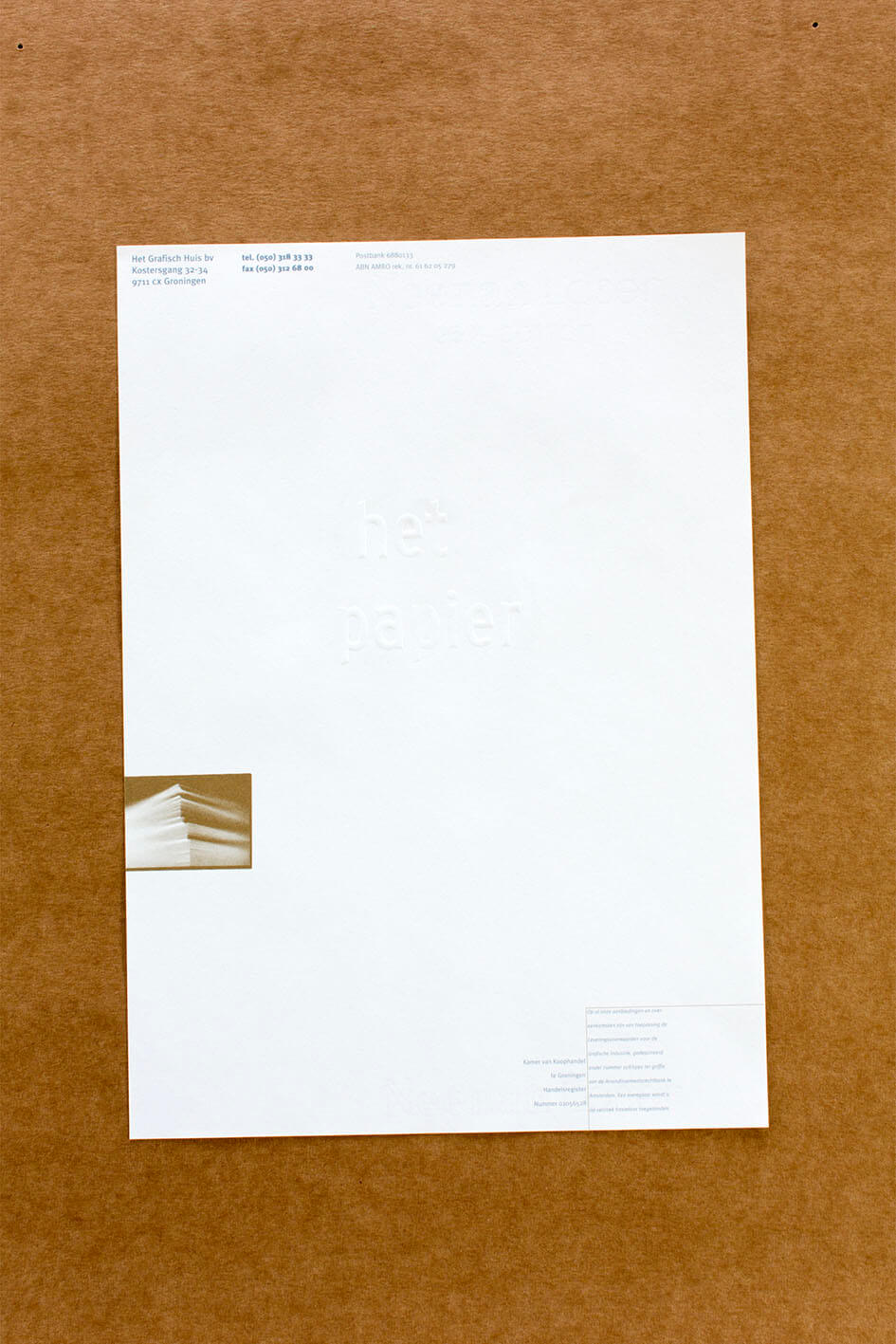
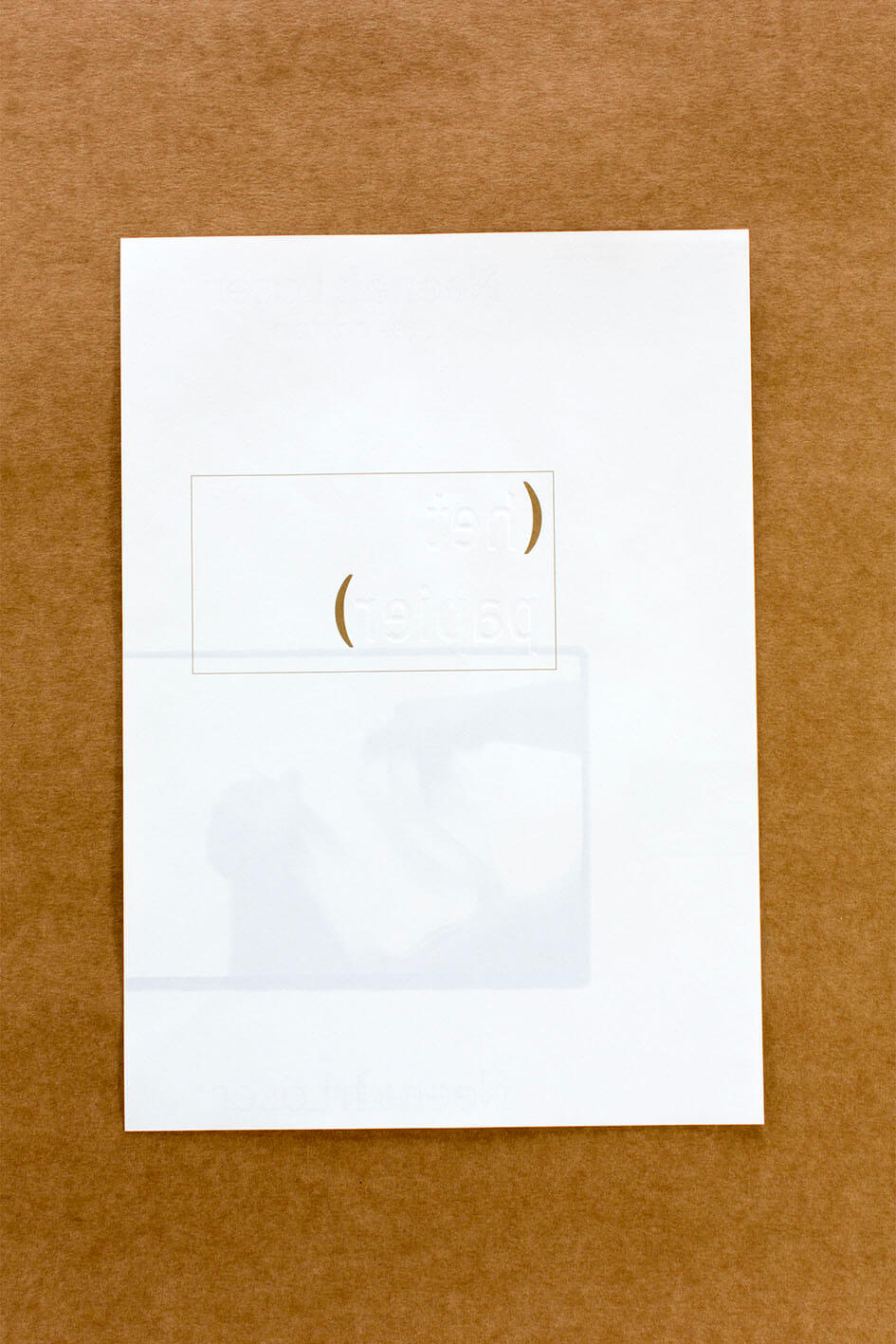
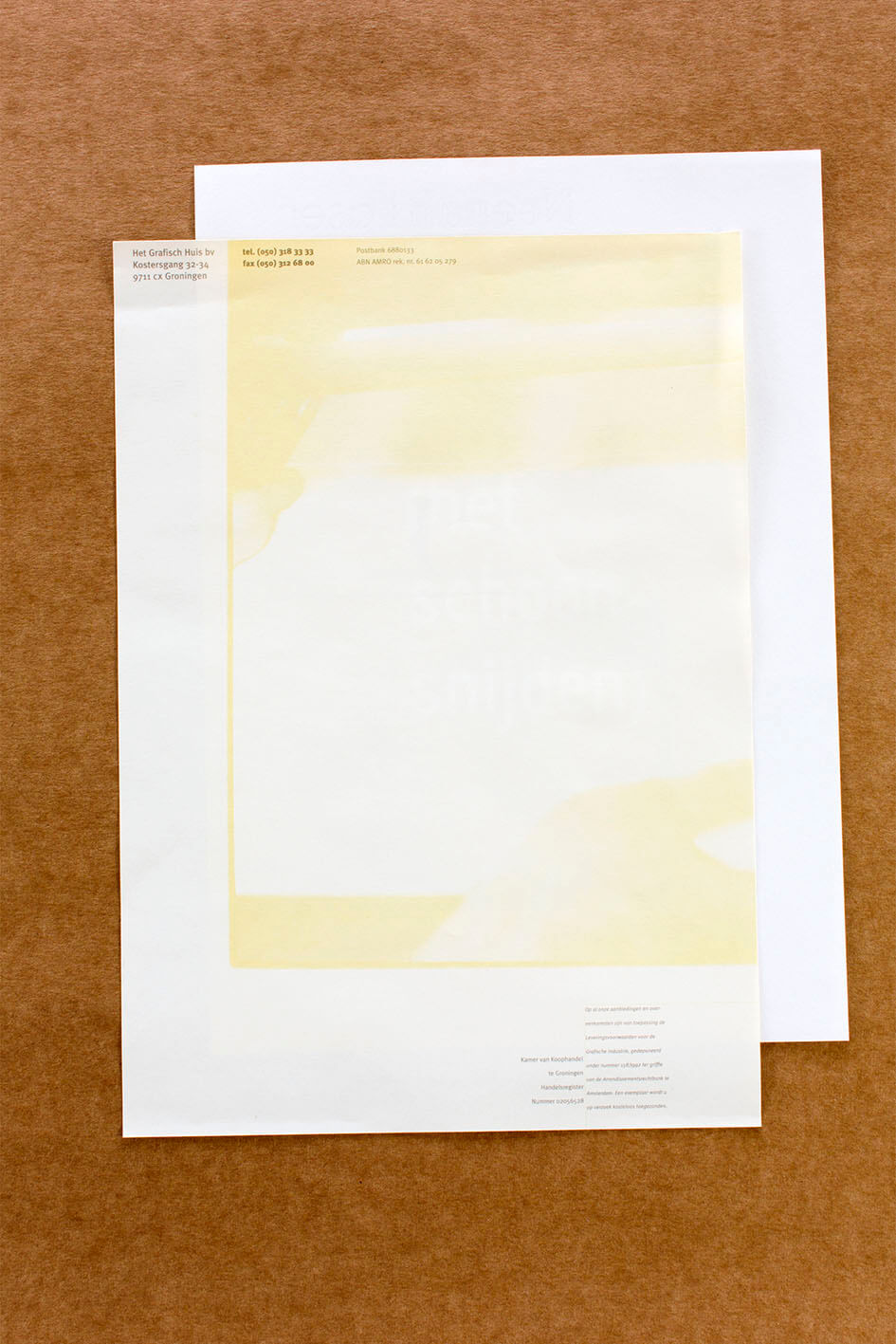
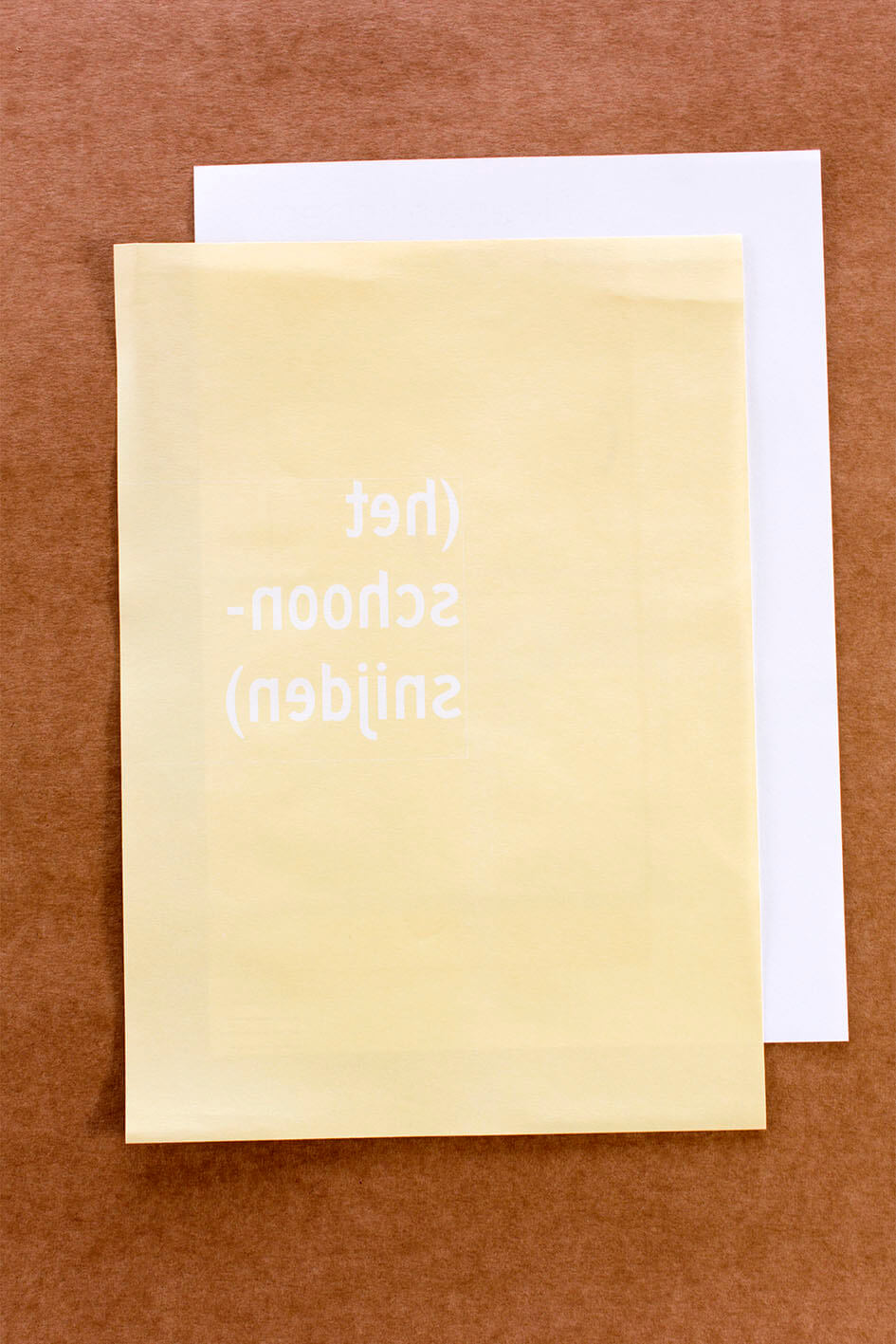
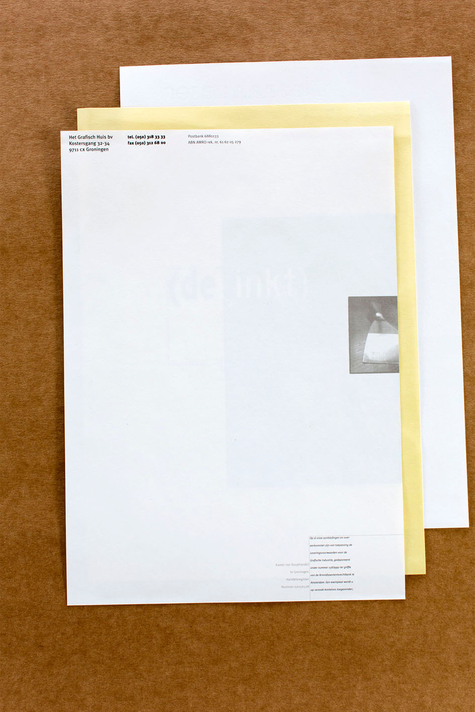
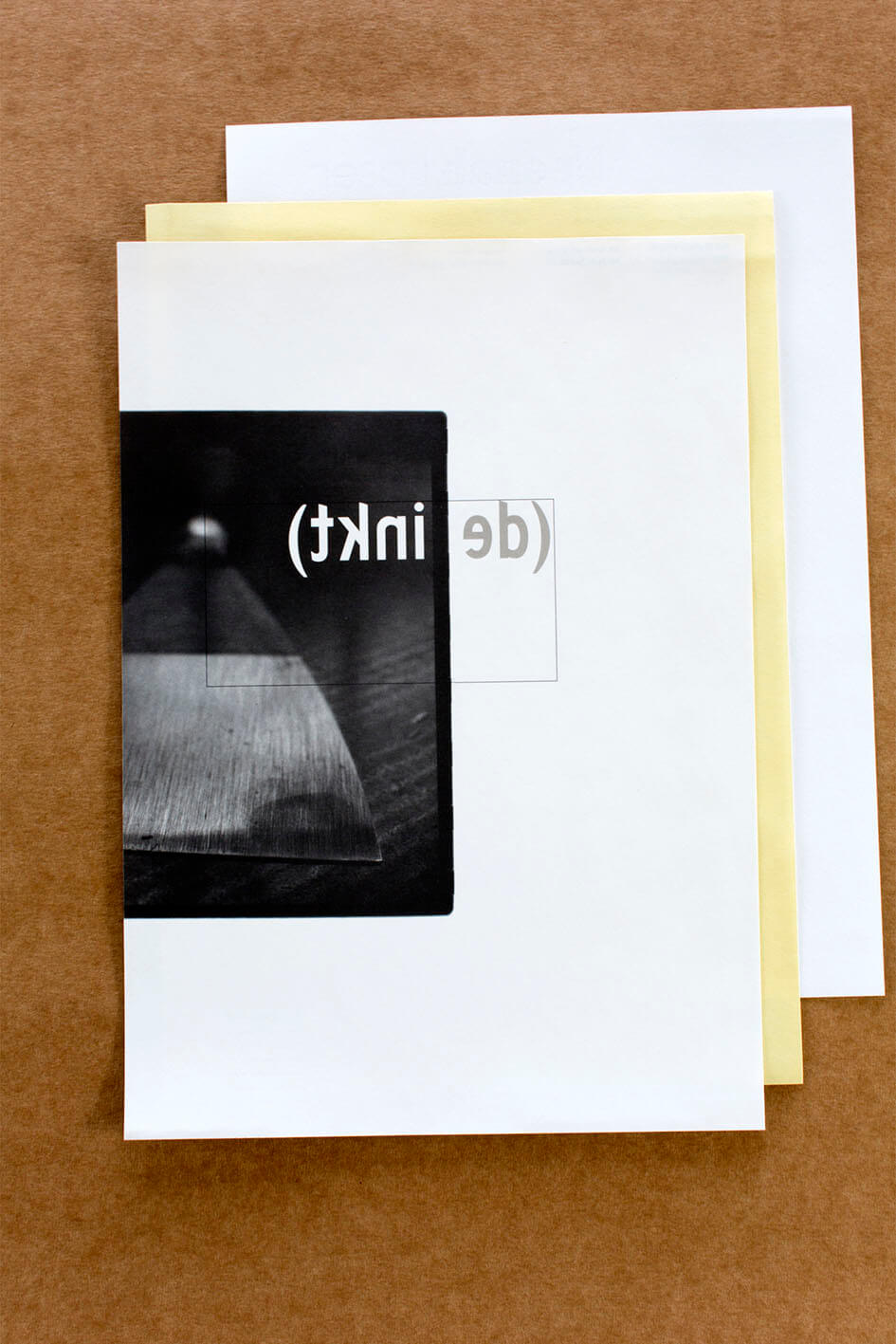
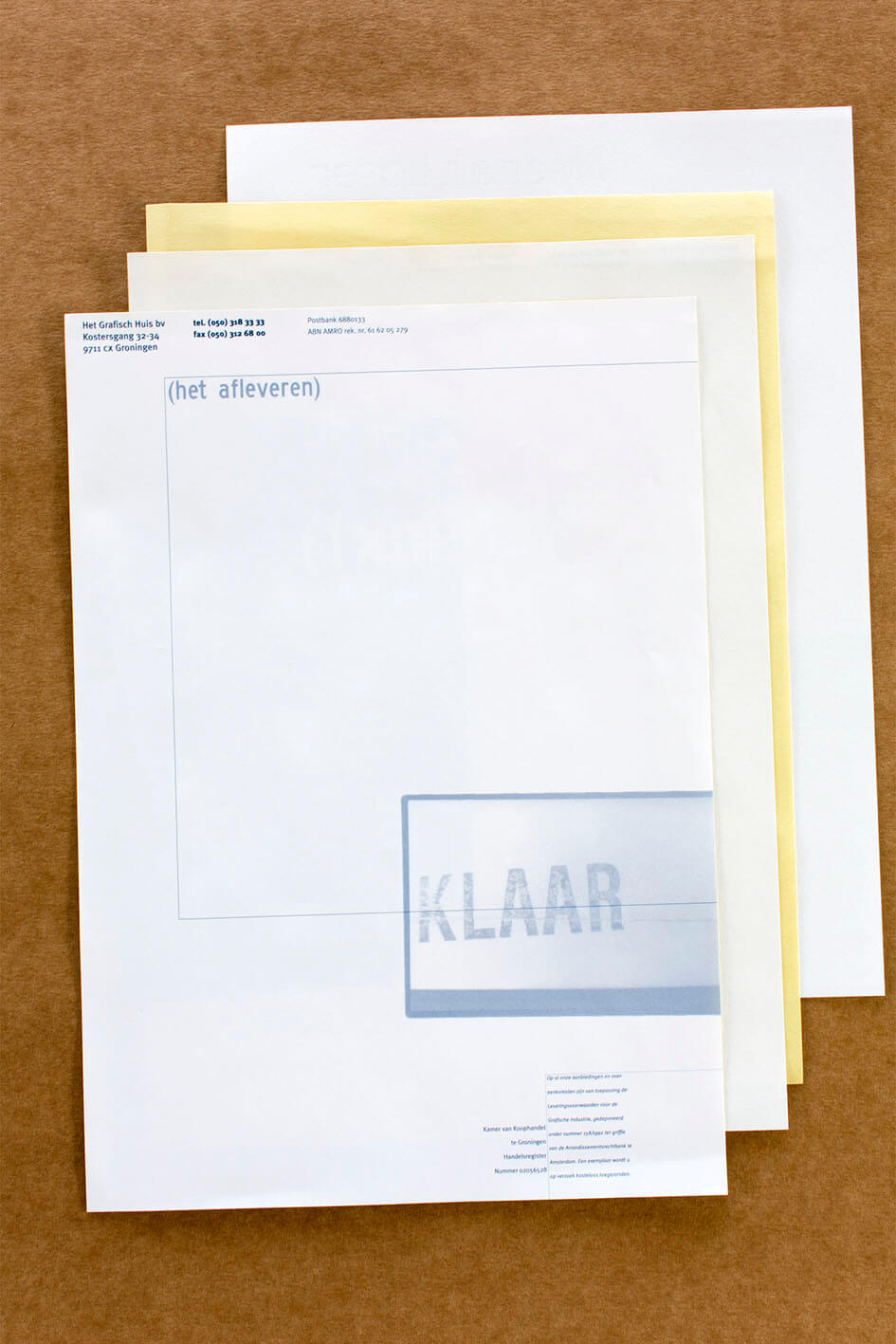
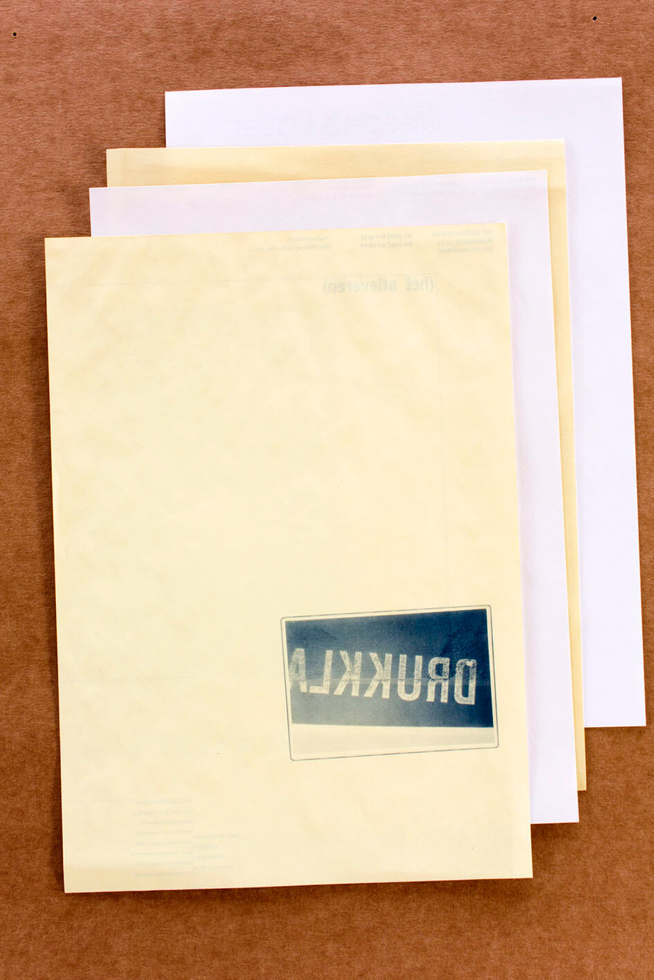
Briefpapier I toont De Inkt, in de vorm van een inktmes, met de titel van dit papier gespiegeld op de achterkant. Briefpapier S op een andere papiersoort gaat over het schoonsnijden. De achterkant is aflopend bedrukt, de titel weer in spiegelschrift. Voorop een beeld van het aanleggen van het papier in de snijmachine. Briefpapier P gaat over het Papier, die titel is in blinddruk aanwezig in dit prachtige, lompenhoudende papier met watermerk. De achterzijde toont de drukker die het papier losschudt alvorens te gaan drukken. Ook hier leveren voor- en achterzijde van het papier één beeld op.
Printing firms incline to showcase their professional abilities through their print works. Each house style printed on a different paper type, for each application a different colour. Unity in diversity, something like that.
Stationery I features The Ink, symbolised by an ink knife and the stationary’s title in mirror writing on the back side. Stationery S, for which a different paper type was used, refers to (cover) trimming. The back side is printed in full bleed, the title again in mirror writing. The cover features a picture of paper being fed to the cutting machine. Stationery P is about Paper, this title is embossed in this beautiful rag paper with a watermark. The back side features a printer loosening sheets of paper before he starts printing. Here as well, the front and back of the paper form an integrated image.