es/say | de/scriptie
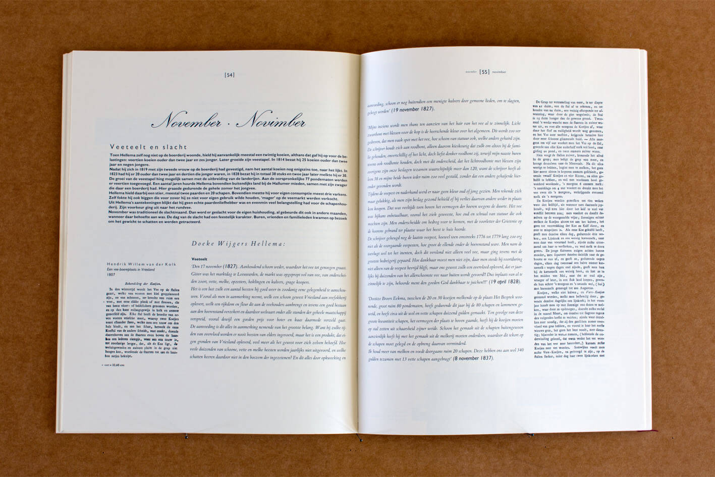
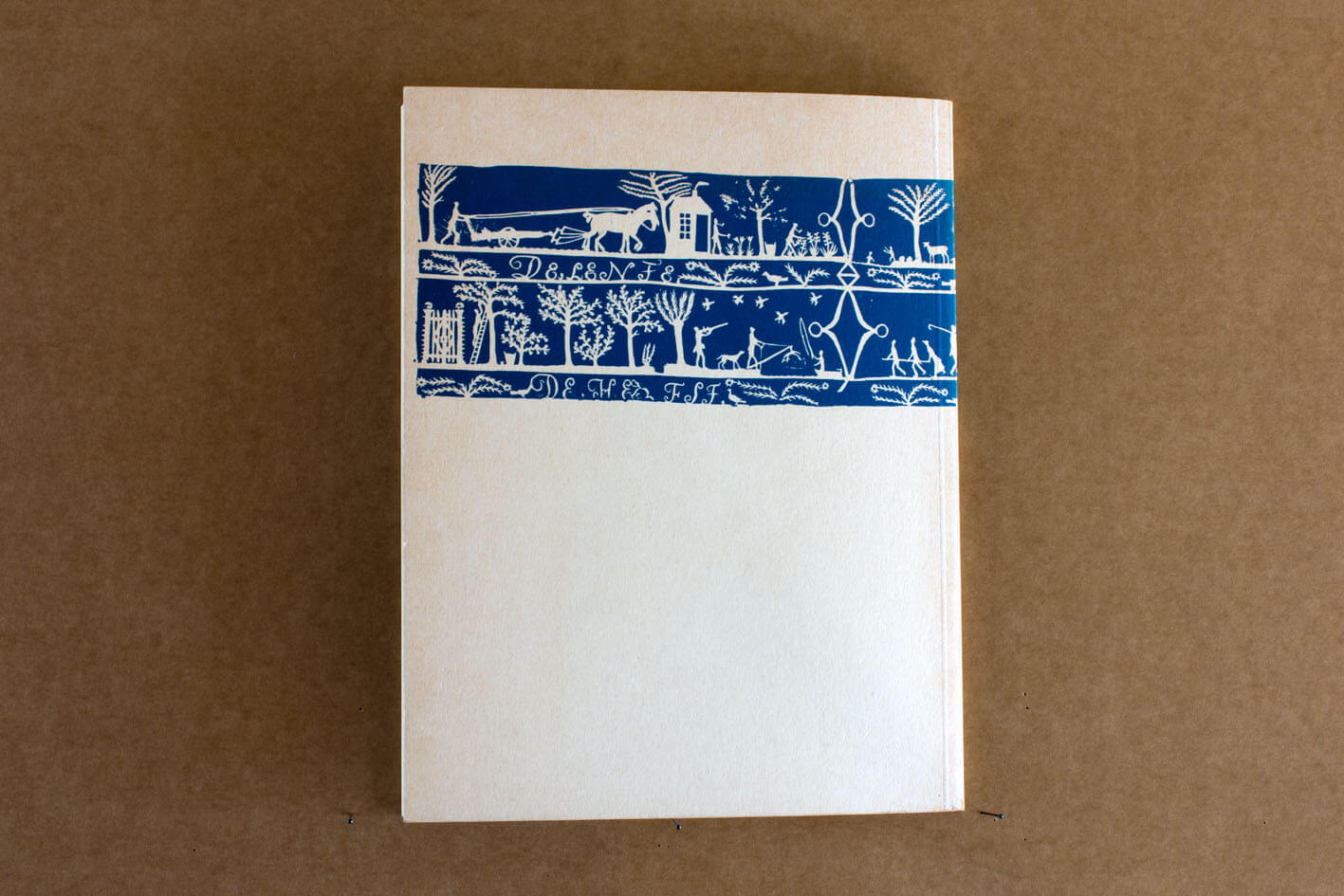
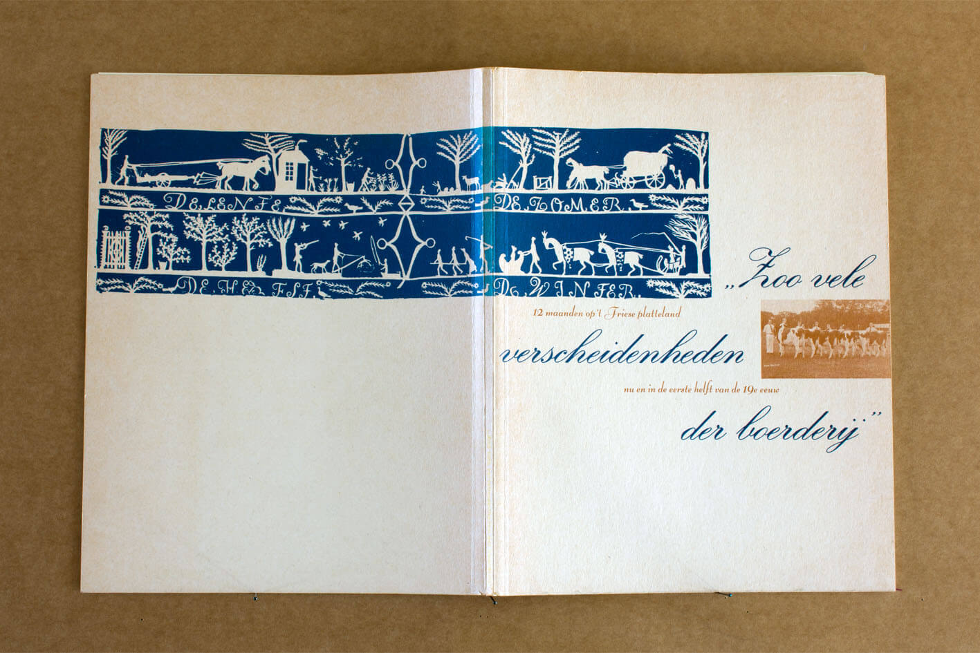
Catalogus gemaakt voor de expositie ‘Zoo vele verscheidenheden der boerderij’ in het Fries Museum in 1990, samen met Henk Suurling. Ik had net het deconstructivisme ontdekt en stelde alle regels van het grafisch ontwerp ter discussie. Hier heeft het er toe geleid dat alle toelichting op de tekst, waarvoor je een kleiner corps zou kiezen, nu juist in een groter corps is gezet. Wat normaliter ondergeschikt is aan de hoofdtekst neemt haar nu onder vuur: de bijzaken springen in het oog! Later zou ik ontdekken dat deconstrueren wel wat meer vraagt dan deze simpele omkering … misschien is het beter van een dékanstructie te spreken.
Op de boerderij vindt alles orde vanuit het gebruik: stallen staan op het erf zó dat je gemakkelijk met de trekker naar binnen rijdt. Voor dit boekje is een stramien ontworpen dat we daarna eenvoudig vol lieten lopen met de inhoud. Er is niet gestreefd naar evenwichtigheid of schoonheid – waar ze er toch is gekomen is dat het gevolg van de procedure, niet meer. Een pagina is een akker en een ontwerper is haar boer …
A catalogue designed for the exhibition ‘Zoo vele verscheidenheden der boerderij’ (‘So many farm varieties’) held in 1990 in the Fries Museum (the Netherlands)*, together with Henk Suurling. At the time I had just discovered deconstructivism, which had caused me to start questioning all the general rules of graphic design. In this case this resulted in the reversed use of letter sizes, allowing the letter size for the side notes – normally quite small – to be in fact larger than the one used for the core text. So here the main text is sort of ‘attacked’ by the normally lesser important parts of the text: the side issues manage to catch the eye! Later of course I came to discover that there obviously is a bit more to deconstructivism than just simply reversing things … so maybe this catalogue is best referred to asa typical example of dékanstruction’. On a farm everything has its natural place due to how it’s used: the stables for instance are positioned towards the yard in such a way that they can be easily accessed with a tractor. For this booklet a master plan was first designed, after which the booklet almost automatically appeared to fill itself with content. Balance or beauty was not the thing aimed for here – whenever this unintentionally does occur is was clearly the result of the procedure, nothing else. A page is a crop field, and a designer is its farmer…
* The country’s largest Frisian provincial museum in the city of Leeuwarden.